CoinGate Dashboard: Rebuilding the Core
Improved onboarding, dashboard UX, and transaction flows for a fast-growing fintech startup. Created a design system and led cross-functional workshops.


No unified brand direction. Visuals, tone, and strategy were inconsistent across design and marketing teams.
Initiated the branding project, pitched to leadership, led workshops, built tone of voice, visual language, brand values, and design system. Promoted to Head of Design after the process.
Align 50+ people around a single brand identity—without killing the startup spirit.
Create a brand rooted in values. Treat brand and design system as living, evolving tools, not fixed rules.
New brandbook, tone of voice, visual direction, and component-based design system. Balance structure + room for experimentation.
Brand consistency across departments, faster design onboarding, stronger internal alignment. Enabled future updates to be made within a shared framework. Sparked cultural change.

When I joined CoinGate as a Senior UX Designer in the dashboard team, the product was growing fast—but our brand wasn’t keeping up. Every designer had a slightly different take on what "CoinGate style" meant. Marketing had their version. Support had another. Even within product design, we lacked design system. It created friction—internally and for users.

Soon after, I connected with two other designers: Eglė (UX designer with laser-sharp instincts) and Monika (a visual designer who could charm even the most stubborn font into elegance). We started meeting every Friday to talk through the mess—the good, the bad, the absurd. We jokingly called it "Cry on a Designer’s Shoulder." But in those honest conversations, a bigger idea took shape: we needed to build a real brand. One that everyone could stand behind.
We later learned that this wasn’t the first time someone had tried. Eglė shared that others had attempted to create a brand book before—but it never got approved. The attitude back then was, “We have nice a logo don't change it, and colors are fine.” So part of our challenge wasn’t just creating something new—it was changing minds.
I put together a proposal for leadership. The message was simple: we're no longer a startup of 10 people throwing things at the wall. We're a growing team. We need clarity—not only in how we design, but in how we communicate who we are. Stability matters. A clearly aligned course reduces internal friction, cuts costs, strengthens the team, and makes the brand more memorable.

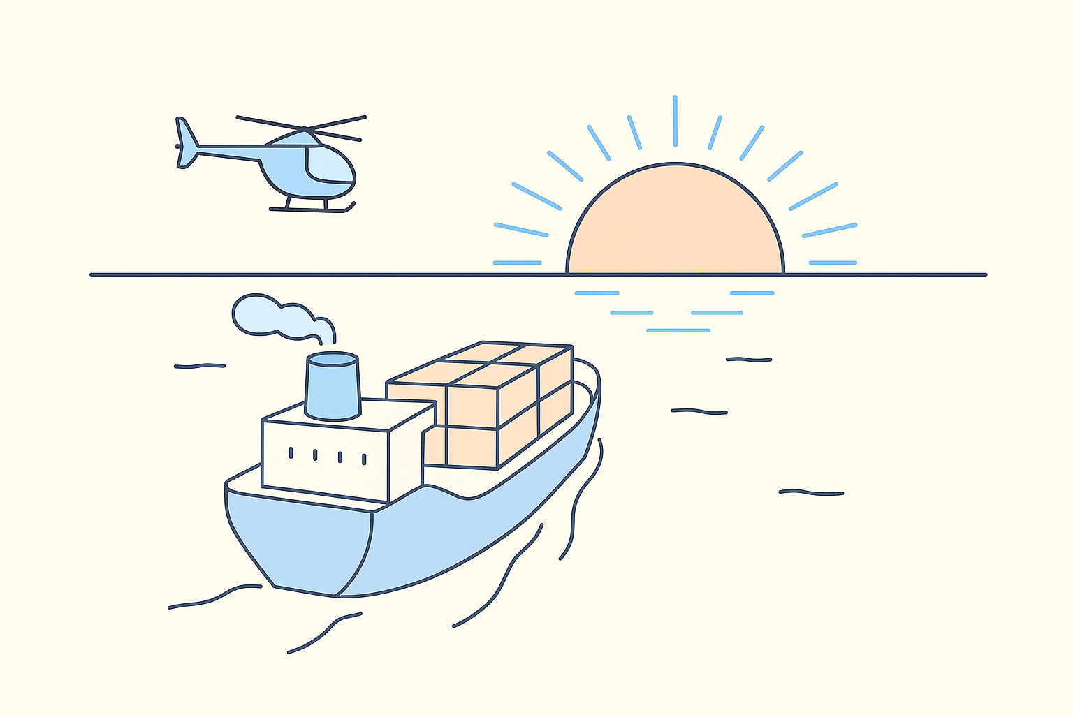
But I knew one of our founders strongly valued experimentation. So it was important to leave room for that, too. To explain the balance, I introduced a metaphor: our brand would be a ship with a helicopter. The ship provides direction and structure, while the helicopter represents our ability to explore, test, and occasionally veer off-course. The metaphor landed. It helped everyone see how we could be both focused and flexible.
This wasn’t just about picking colors or choosing a tone of voice. We wanted to build a brand that reflected what we believe, how we work, and who we build for. Our process had three parts:
We began with research: team interviews, competitive analysis, and product deep-dives. What we saw in the crypto space was overwhelming: sci-fi aesthetics, over-promising slogans, and lots of talk about "the future is now."
But our users weren’t living in the future—they were trying to buy and get paid today.
So we made a conscious decision: our brand would be grounded in reality. Human, clear, confident.

We ran workshops to define the values that would shape our brand and our product decisions.
Functional Values:
Emotional Values:
Transformational Value:
We chose the Navigator as our brand archetype—someone who guides, supports, and adapts. Not flashy. Not cold. Just reliable and human.
We then translated that into our visual and verbal identity:
We didn’t create a brand book. We created a brand system, design system, UI system.
It gave structure to how we work, design, write, and build. It brought alignment across design, product, and marketing. And it stayed flexible—open to iteration, open to people.
This project wasn’t just about branding. It was about making CoinGate feel like one company—not five teams speaking different dialects.
We built a brand that feels like us. And we’re proud of what it became.